Supply chain · Interactive explainer
Show them the math
everyone else avoids.
Load optimisation software is invisible by definition — it works inside systems buyers can't see. The value was real but abstract. Prospects couldn't connect the software to the savings. So we made the math visible — in real time, in 3D, on their actual load scenarios.
The problem
You can't sell invisible software
with a slide deck.
ProvisionAI's load optimisation software worked inside systems buyers couldn't see. The value was real — 5–10% more product per truck, zero overweight violations, repeatable across every shift — but abstract. Prospects couldn't connect the software to the savings.
Every demo started with twenty minutes of explaining what the product did before anyone could talk about why it mattered. The gap between what the software did and what the prospect could feel was killing deals before they started.
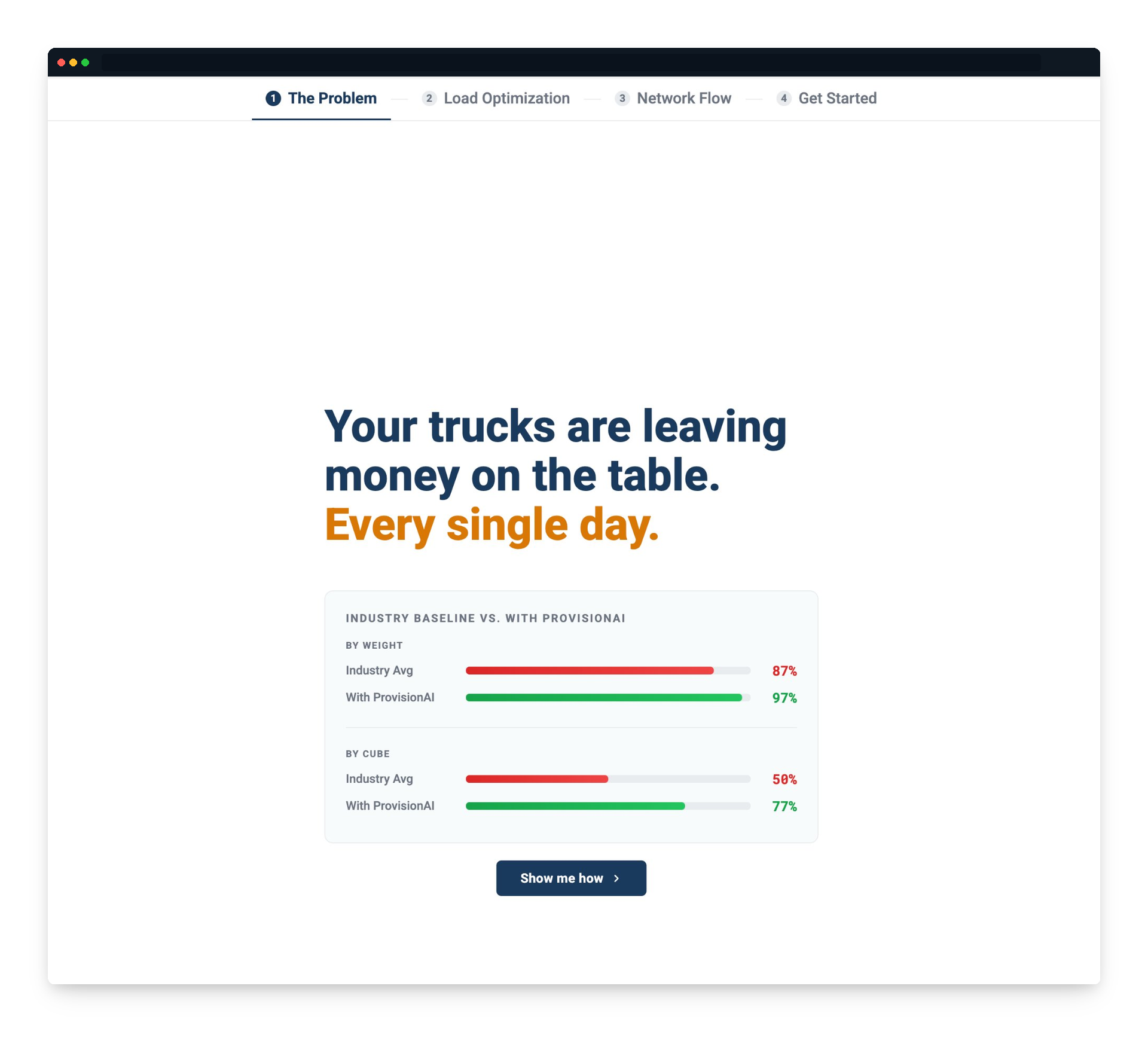
The problem screen — industry baseline vs. ProvisionAI, shown before the product
The design decision
The experience starts by showing the gap — not the product. The prospect sees what they're losing before they see what fixes it. By the time the 3D visualiser loads, they already want to know the answer.
Section 02 — Load optimisation
Watch the algorithm
pack their truck.
Three real load scenarios — beverage max fill, CPG mixed load, food and beverage mixed. The buyer selects their scenario and watches the optimiser run in real time. 96% capacity used. 77k lbs. LEGAL — axle-compliant across all 50 states.
A bar chart says 96%. The 3D model shows 96%. There is no ambiguity about what the number means when you can see the truck. The abstract becomes concrete — and the question shifts from "does this work?" to "when can we start?"
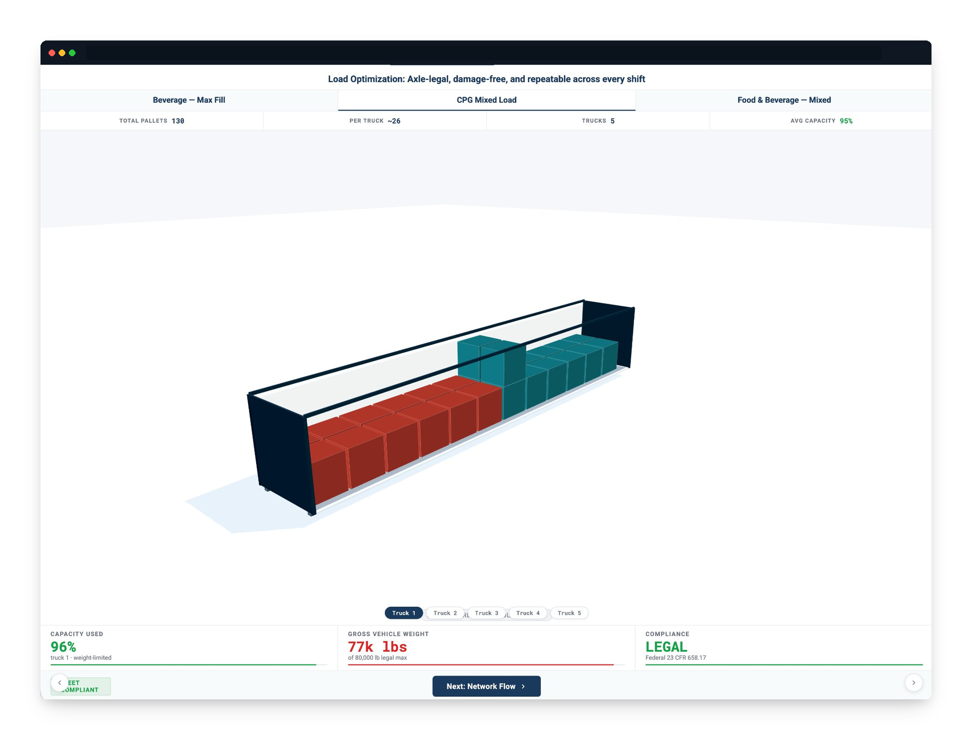
CPG mixed load — 130 pallets, 5 trucks, 95% avg capacity. Drag to orbit, scroll to zoom.
Section 03 — Network flow
Before and after,
side by side.
Three scenarios: normal week, promotion spike, carrier shortage. The left panel shows what their flow looks like today — chaotic bars spiking above dock capacity. The right panel shows the LevelLoad plan — the same volume, smoothed and executable.
97% OTIF. −6.4% cost impact. 98% first tender acceptance. −62% volatility reduction. These aren't projections — they're what the model produces from the scenario the buyer just selected. Their network. Their numbers.
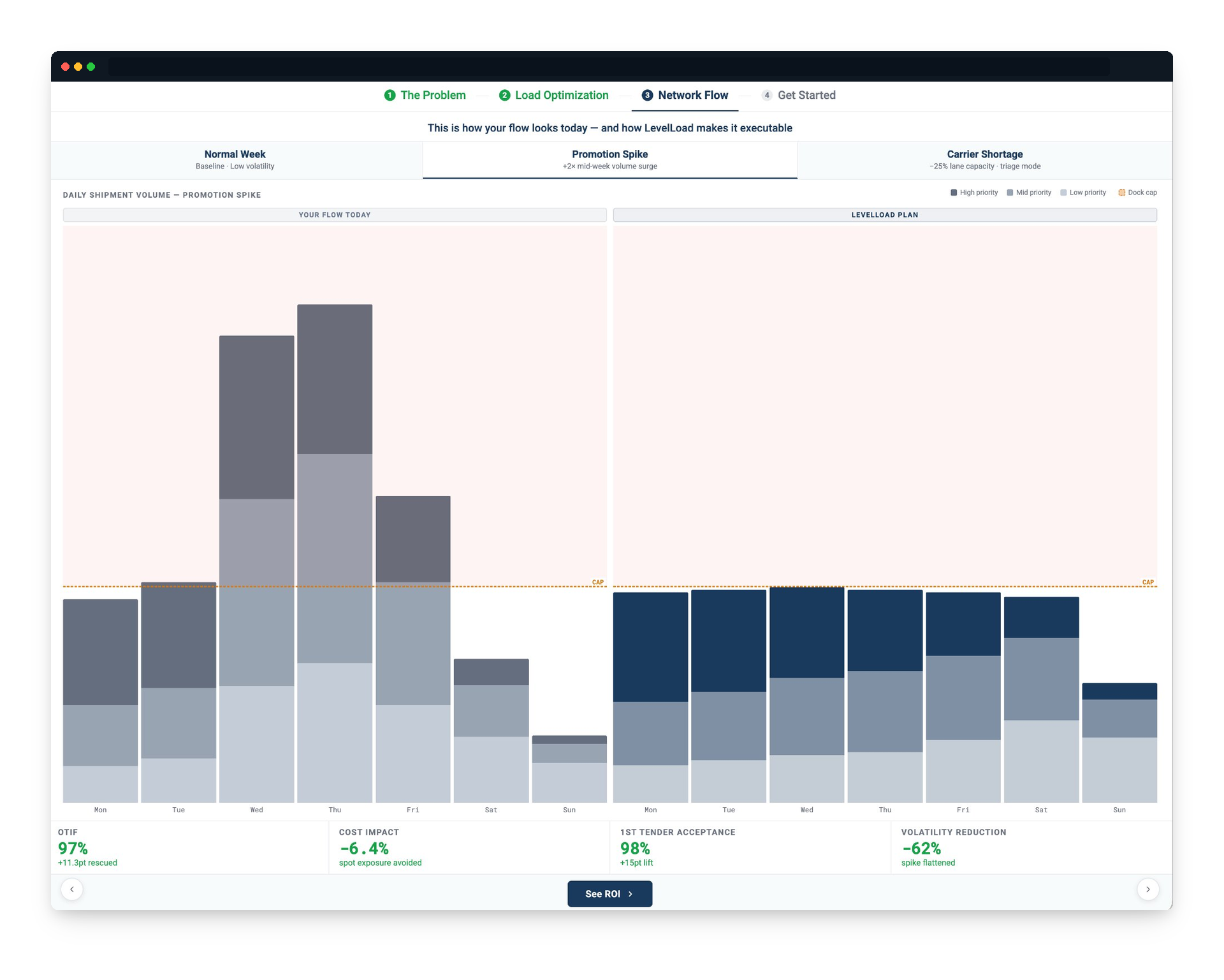
Promotion spike scenario — your flow today vs. the LevelLoad plan
Section 04 — ROI calculator
A number they
built themselves.
The buyer enters their annual freight spend. They move a slider to their assumed savings rate. The calculator returns annual savings, monthly savings, and the rate — live, as they adjust.
At $3.5M freight spend and 7% savings: $245K annually. $20K a month. A number the buyer calculated themselves is worth ten times a number a rep quoted them. They can't argue with their own maths.
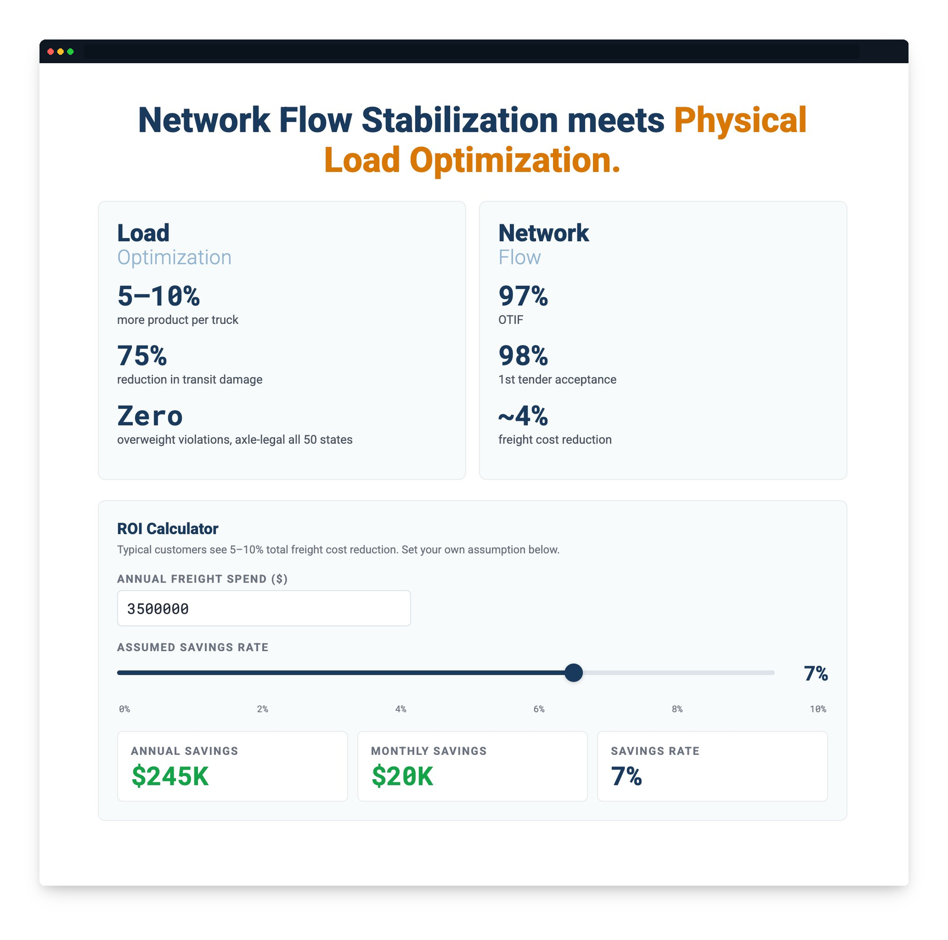
ROI calculator — their freight spend, their savings rate, their number
What it changes in the room
The rep arrives to a prospect who has already run the numbers. The conversation is about implementation, not justification. The ROI conversation starts before the first call — without a rep in the room.
See it for yourself.
The experience is live. Walk through all four sections — the problem, the 3D loader, the network flow simulator, and the ROI calculator. It takes about four minutes.